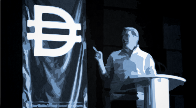
This week I wrote a post about Cameron Sinclair and Architecture for Humanity.
In and amongst all the discussion at and about Design Currency – now a week and a half ago – there is one talk that stands out for me. And it is not to do with the way it was said, or its value to business, or its philosophical implications, or its parallel struggles with marketing in the corporate decision making process. It had to do with Cameron Sinclair’s talk on architecture for humanity, an organization that he founded:
“Architecture for Humanity is a nonprofit design services firm founded in 1999. We are building a more sustainable future through the power of professional design.”
Sounds good. But what does that mean in practice? The most recent (and current) example illustrates this well…
It would be hard not to notice the massive earthquakes in the news lately – in particular Haiti’s 7.0, and Chile’s 8.8. If one were to continue to follow the stories, it would also be hard not to note the difference in casualties:
- Chile 8.8: 486 fatalities, 79 missing
- Haiti 7.0: 92,000 – 230,000 fatalities
Cameron was pretty quick to point out that earthquakes don’t generally kill people – buildings do. And poorly designed buildings at that. Since Chile experienced the incomprehensibly large 9.5 Valdivia earthquake in 1960, they had re-examined how they design buildings – requirements for seismic response changed in response to the environment. The building codes are stricter than a place such as Haiti. And so now we have a case where difference in design policy means a completely massive difference in how a country survives an earthquake. Chile was rocked by the 8.8 earthquake and ensuing tsunamis – any country would be – but Haiti’s buildings were annihilated, and they came down on the people inside.
This is not a trite design discussion. Here we have an extreme example of design currency being equal to human life itself. As was pointed out at Design Week, Haiti is not waiting to rebuild. They’re doing it right now. They have to.
My hat is off to Cameron Sinclair (pictured above) and those at Architecture for Humanity and the Open Architecture Network – an organization which is making better building plans accessible to everyone who is building – or in Haiti’s case – rebuilding.
Find out more about the Haiti rebuilding project on the Earthquake Reconstruction in Haiti page.
—
Some notes on how I made the image above:
- I took the original shot during Design Currency on a Canon 30D with a 50mm lens at F1.4
- Image was resized and refinished in Photoshop and imported to Illustrator
- Spent some time tracing edges in Illustrator, adjusting palette and curve threshhold until his finger and his head looked the way I wanted, as well as the Design Currency logo
- Exported back into Photoshop for the radial gradient linear burn, texture overlay with a soft-light blending mode, and a colourized resaturation to get the blues “just-so.”
Look at the large version to see more of the details (the largest version is over 3000 pixels wide, a bit too large for webbiness.) Some would say the above look is played out, but I think it’s the lack of care in using presets and effects that is played out, and the process itself can still yield pleasing results if done with care.
